Elokon
ELOKON provides smart safety and fleet-management technology for warehouses, manufacturing facilities, and other industrial environments. Its systems use sensors, software, and automation to help prevent forklift collisions, protect workers, and make material-handling operations safer and more efficient.
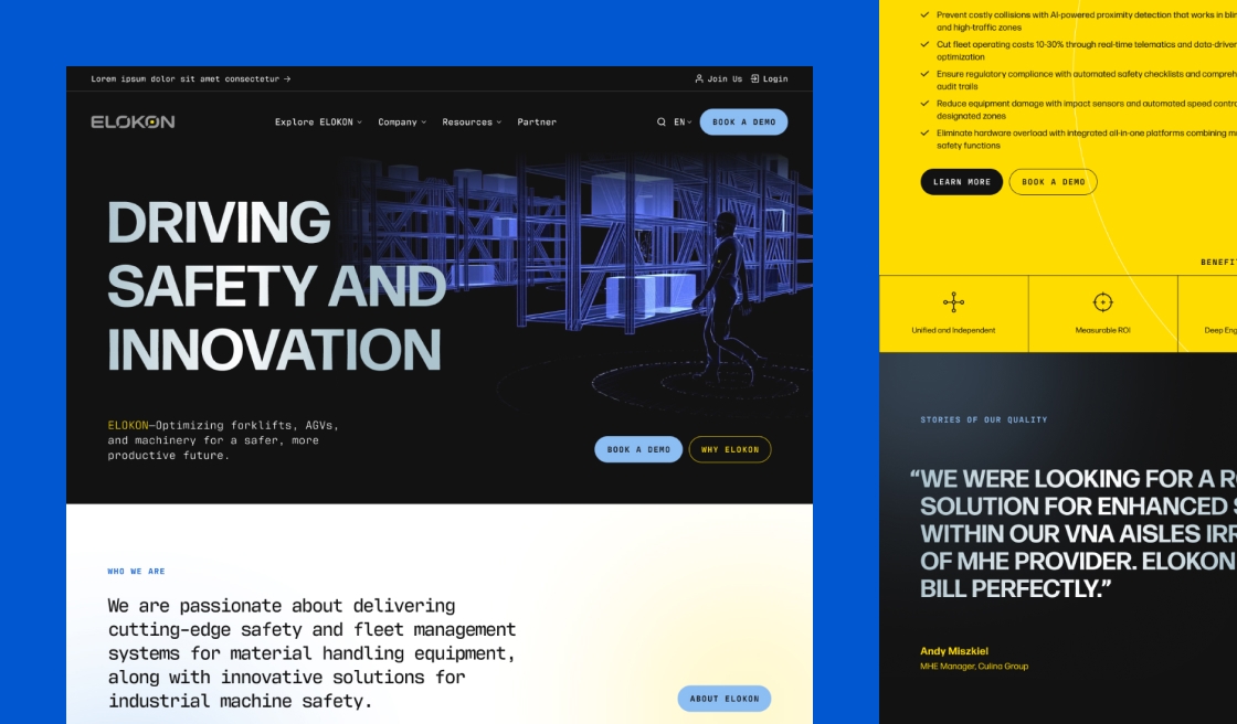
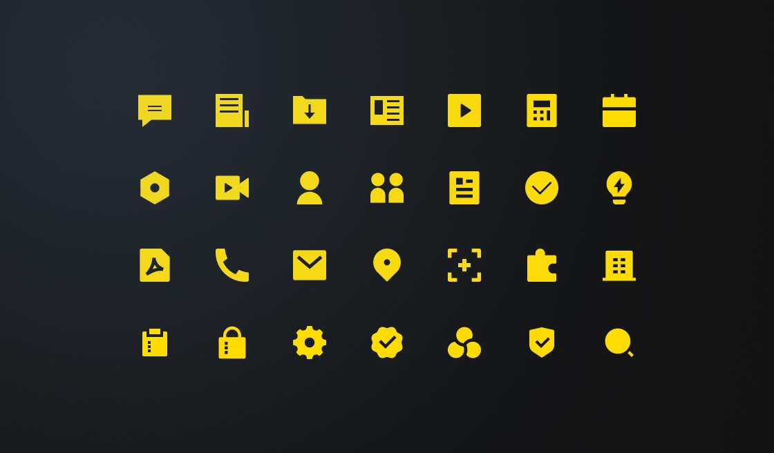
Modernizing ELOKON’s brand to better reflect its technology-driven future
ELOKON came to us with several pain points with their existing brand. Their visual identity felt clunky and dated, failing to communicate their position as a cutting-edge technology company. As a European-based company looking to expand its presence in the American market, they also felt their existing style wasn’t resonating with their American audience.
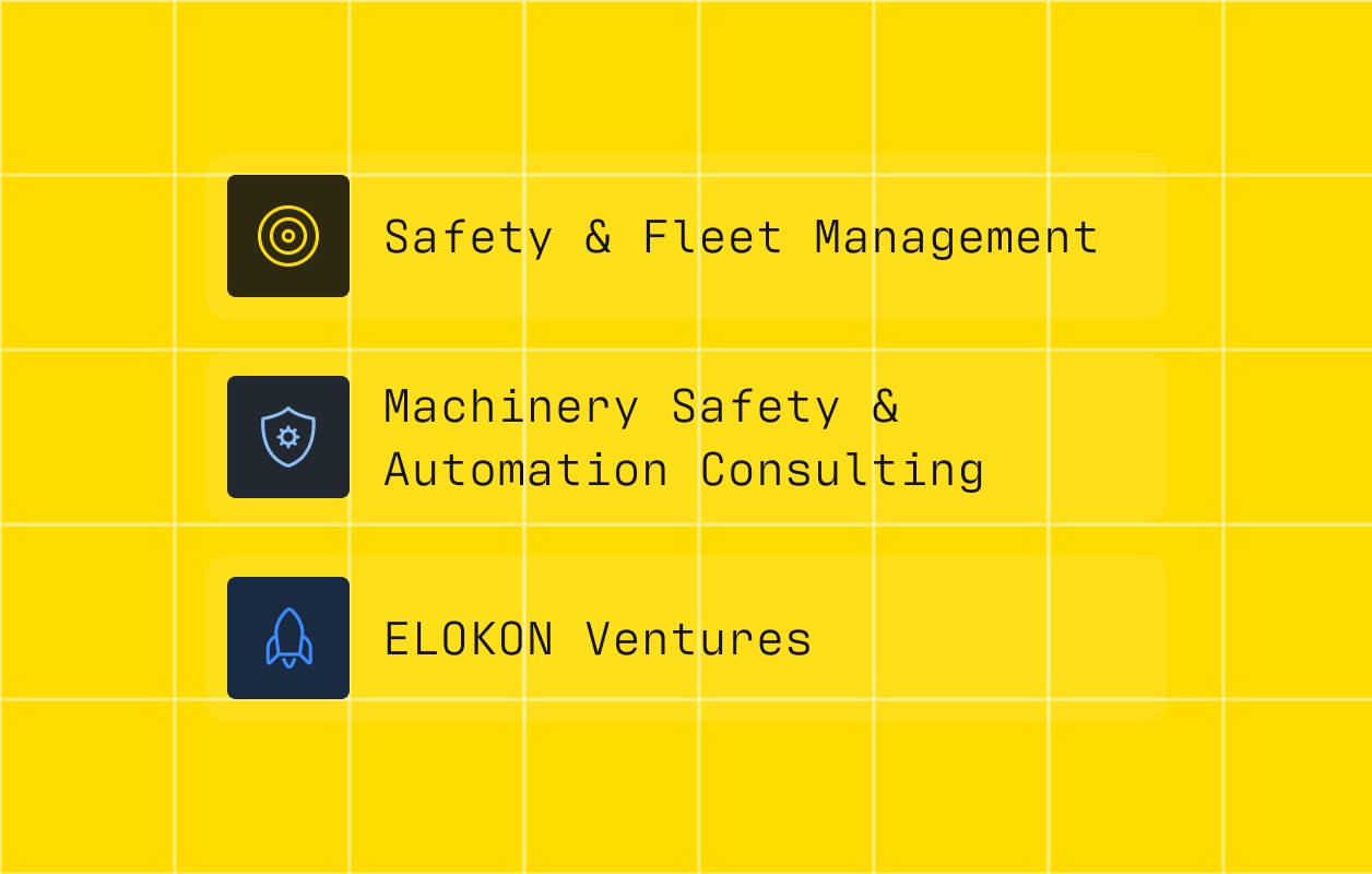
They also needed a clearer way to distinguish their three business units and communicate the unique value each one provides.
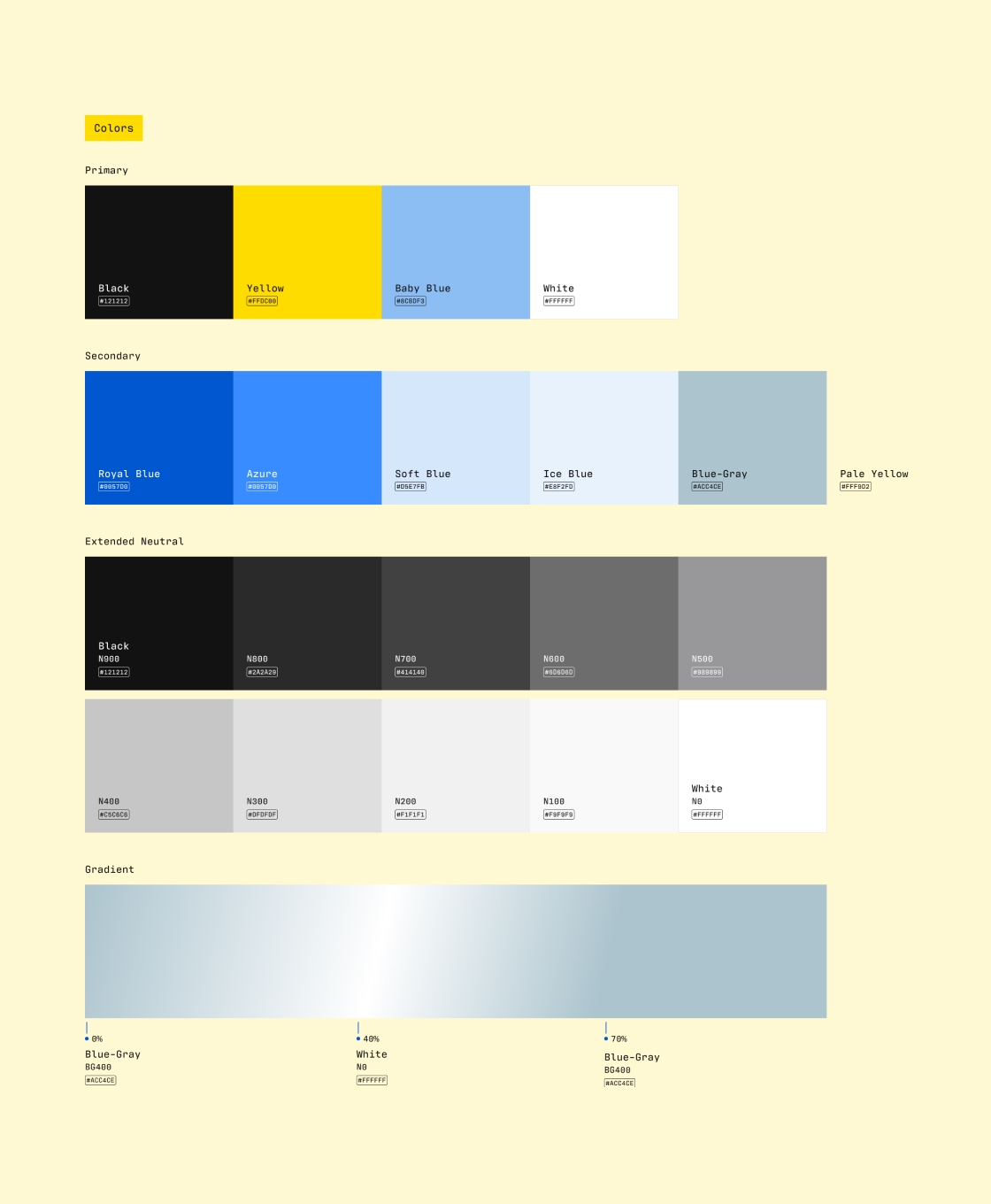
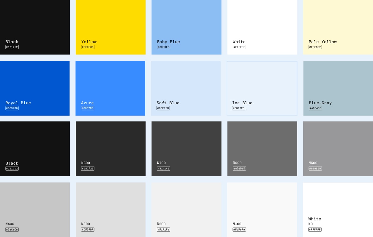
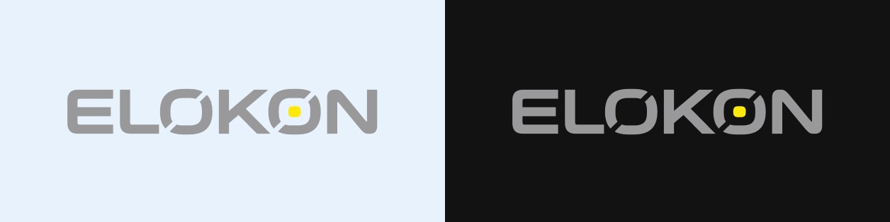
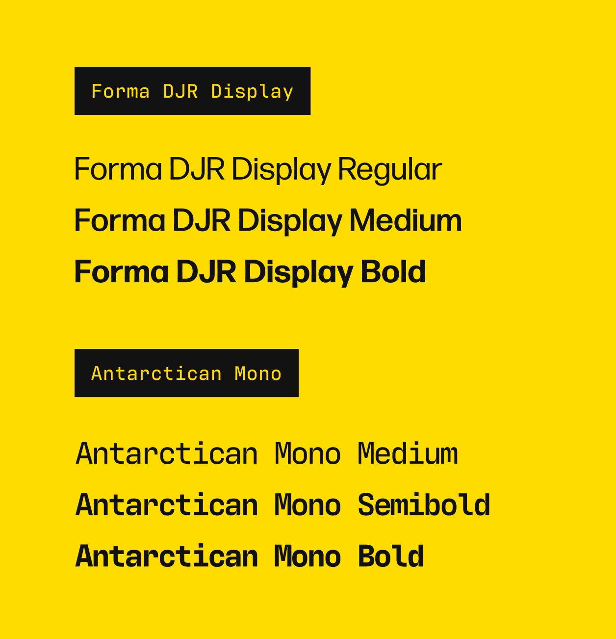
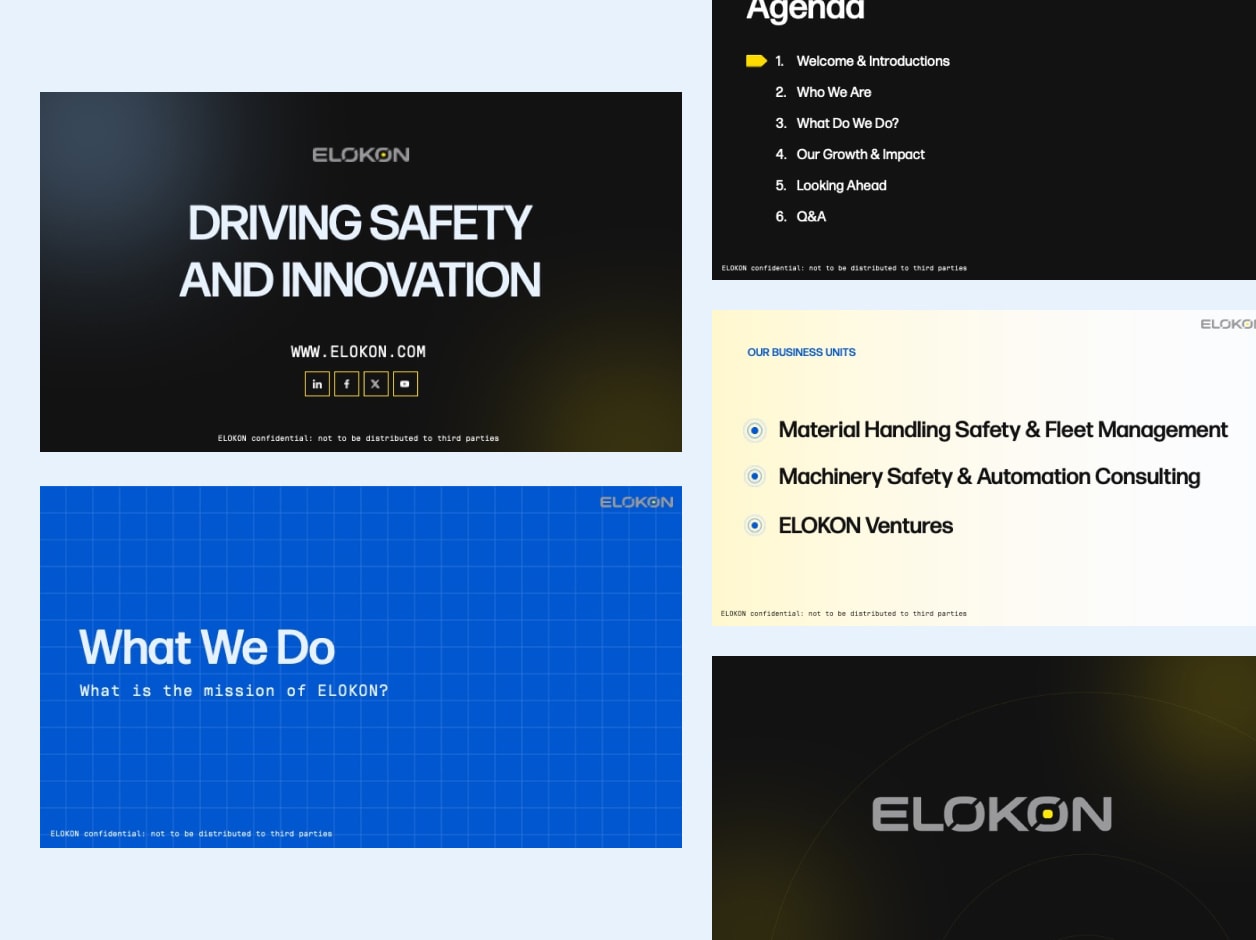
We kept ELOKON’s existing logo and built a refreshed brand system around it that addressed these challenges. We introduced cleaner, more modern typography and new background patterns to strengthen the technology-forward feel, and we expanded their color palette beyond their signature yellow to include blues, deeper grays, and steely tones. The new palette not only reinforces ELOKON’s connection to technology but also speaks to the industrial and warehouse environments they serve. Within the broader brand, we developed distinct color schemes for each business unit, creating visual differentiation while maintaining a cohesive overall identity.
A clearer digital experience that tells ELOKON’s story
Like their branding, ELOKON’s website needed an update to create a clearer, more intuitive experience for users. They wanted to make it easier for customers to understand who ELOKON is, what they offer, and the story behind their work, while also increasing time on site. Overcrowded pages, text-heavy content, and a lack of clear CTAs were making it difficult for users to fully engage with the brand and find the information most relevant to them.
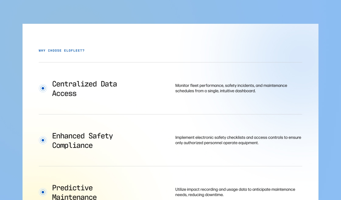
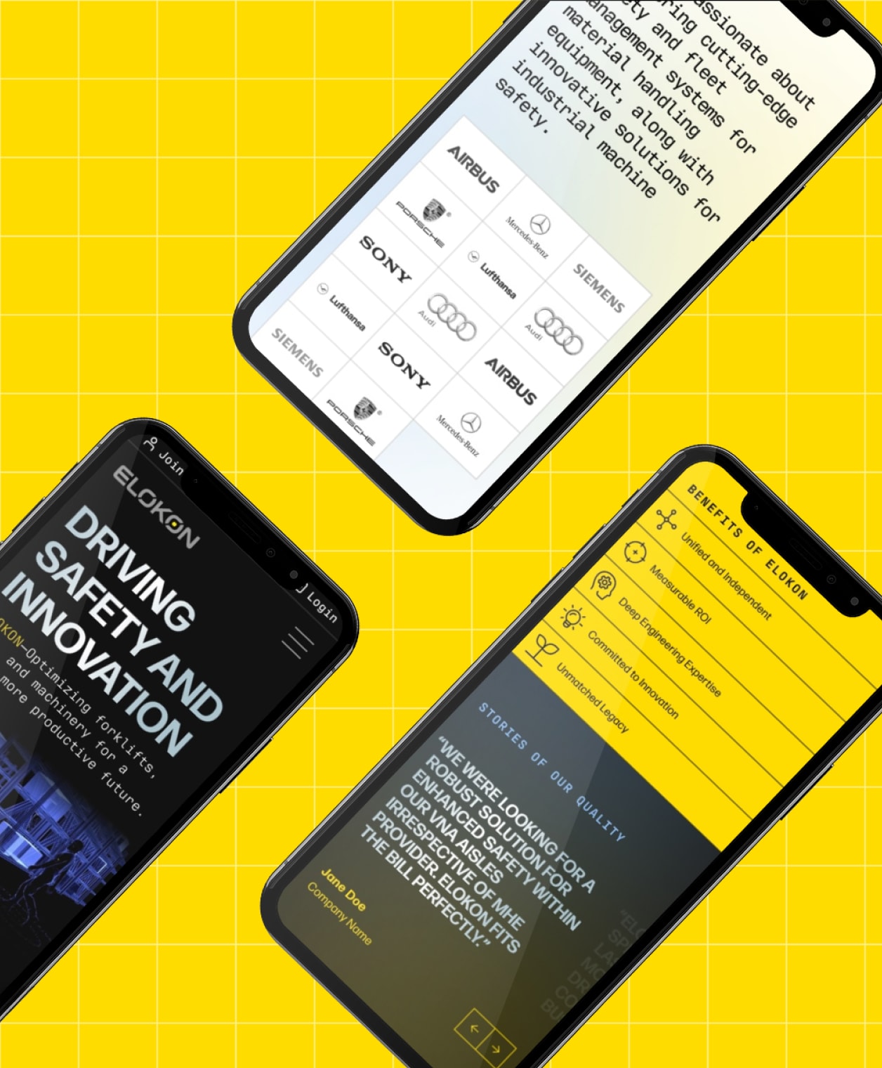
Our work resulted in a flexible, creative design system that brought ELOKON’s refreshed visual identity to life while creating better pathways for the user. We restructured content to tell a more cohesive story about ELOKON: who they are, the industries they serve, and the solutions they provide. We also introduced more interactive components in order to increase user engagement and make it easier for for visitors to quickly find the information that matters most to them.
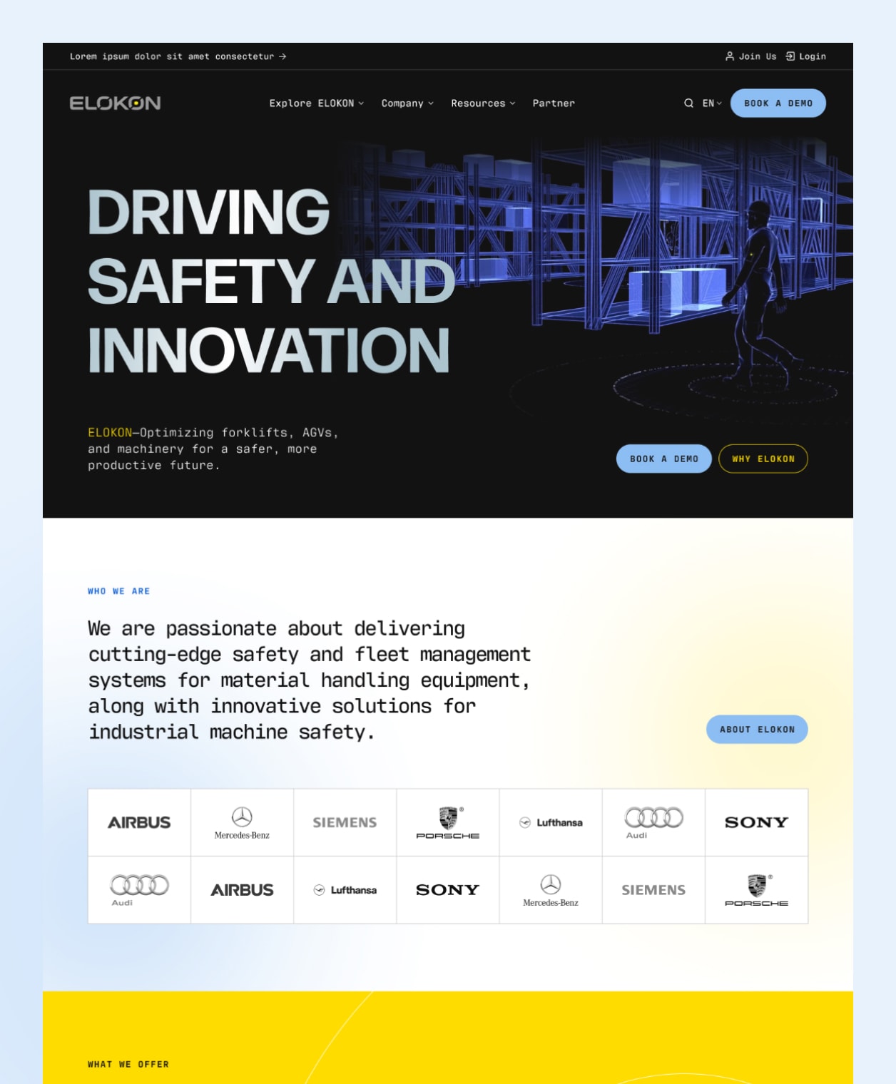

A future-forward design system
Our work with ELOKON created a unified design system that supports their goals and brings greater consistency to their brand story across every touchpoint.

Flexible structure
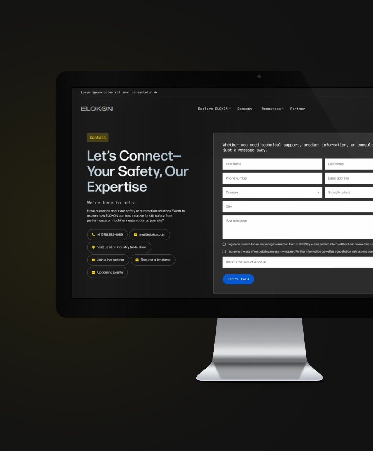
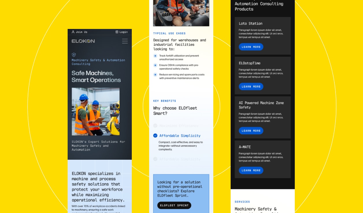
Custom-built components provide ELOKON with a flexible system that keeps content organized and consistent while allowing them to adapt to different content needs.

An interactive experience
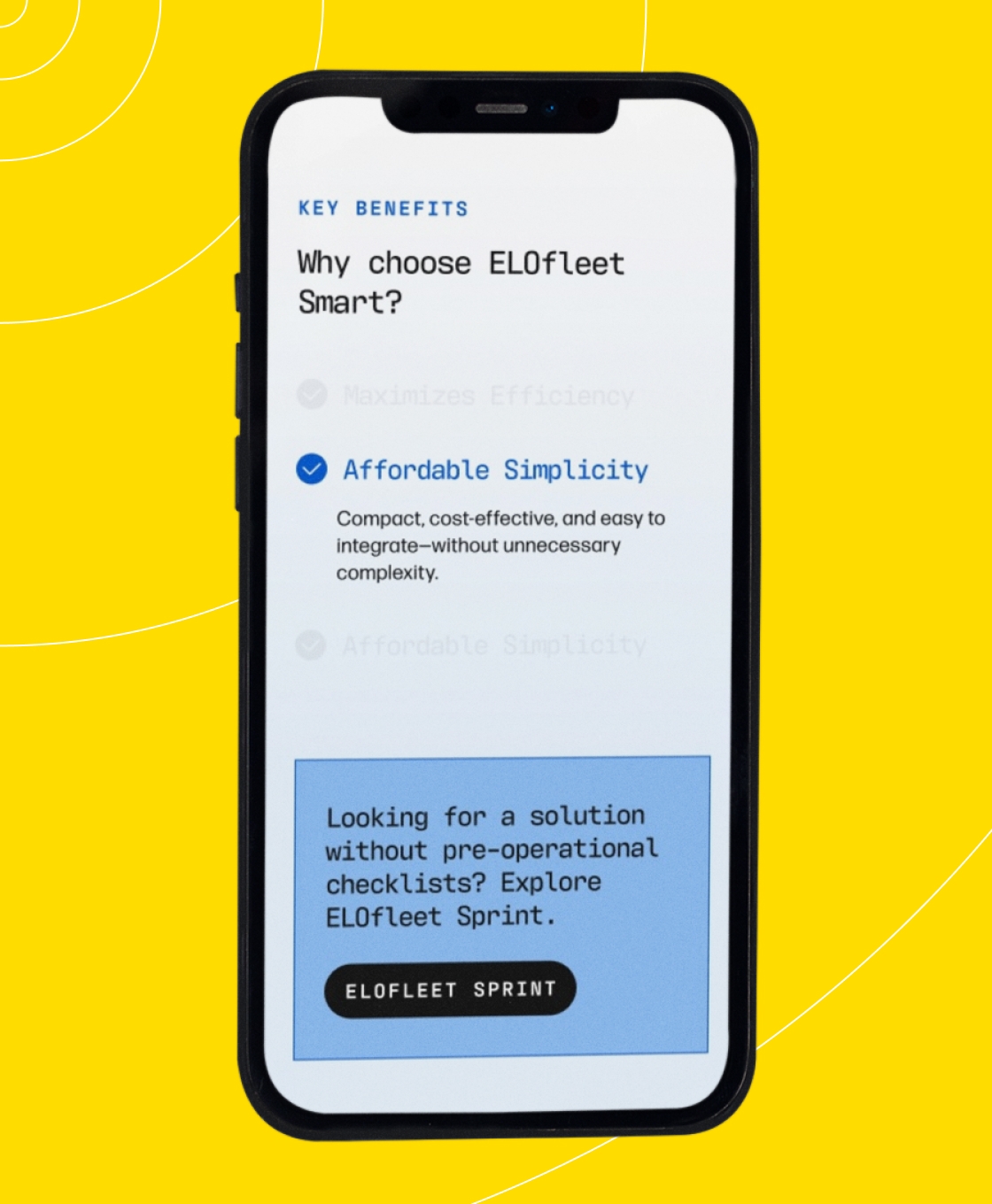
Our goal was to create a website that felt less like an overwhelming information hub and more like an engaging experience, using custom interactive components to bring ELOKON’s story and solutions to life.
"The Punch team's creativity and attention to detail have consistently exceeded our expectations. They turn complex ideas into stunning digital experiences effortlessly."